Showing posts with label DIY. Show all posts

Sunday, 13 April 2014

My Fabulous Pink Kitchen

vintage 50's housewife apron pink kitchen baking dress red high heels turquoise

A little while back I finally got around to doing something I had been planning for ages: paint the kitchen cupboards pink. And didn't it turn out fantastic! I have been thinking of having a vintage-inspired pink tea party...

The original plan was to paint the entire cupboard door pink, but that would have meant taking them of the cabinets and taking them to the garage and then painting first one side and after it had dries the other and it became an overwhelming and very daunting task. But then I thought, hey, why not just paint the middle bit. And so I did.

Ikea kitchen pink vintage
This is how it looked before.


The doors are made of painted MDF and therefore didn't need to be sanded or primed in any particular way. I just gave them a thorough wipe down using a rag and a surface washing liquid specifically designed for the job.

vintage pink kitchen 50's florida tray Pihlgren Ritola Tapettitalo Kihlaruusu


I also took the opportunity to completely get rid of the door above the stove so that the spice shelves could be used for display. I also lined the shelves with leftovers from the Pihlgren & Ritola wallpaper from the opposite wall. It's called "Kihlaruusu", BTW.

vintage fifities kitchen pihlgren ritola tapettitalo Kihlaruusu


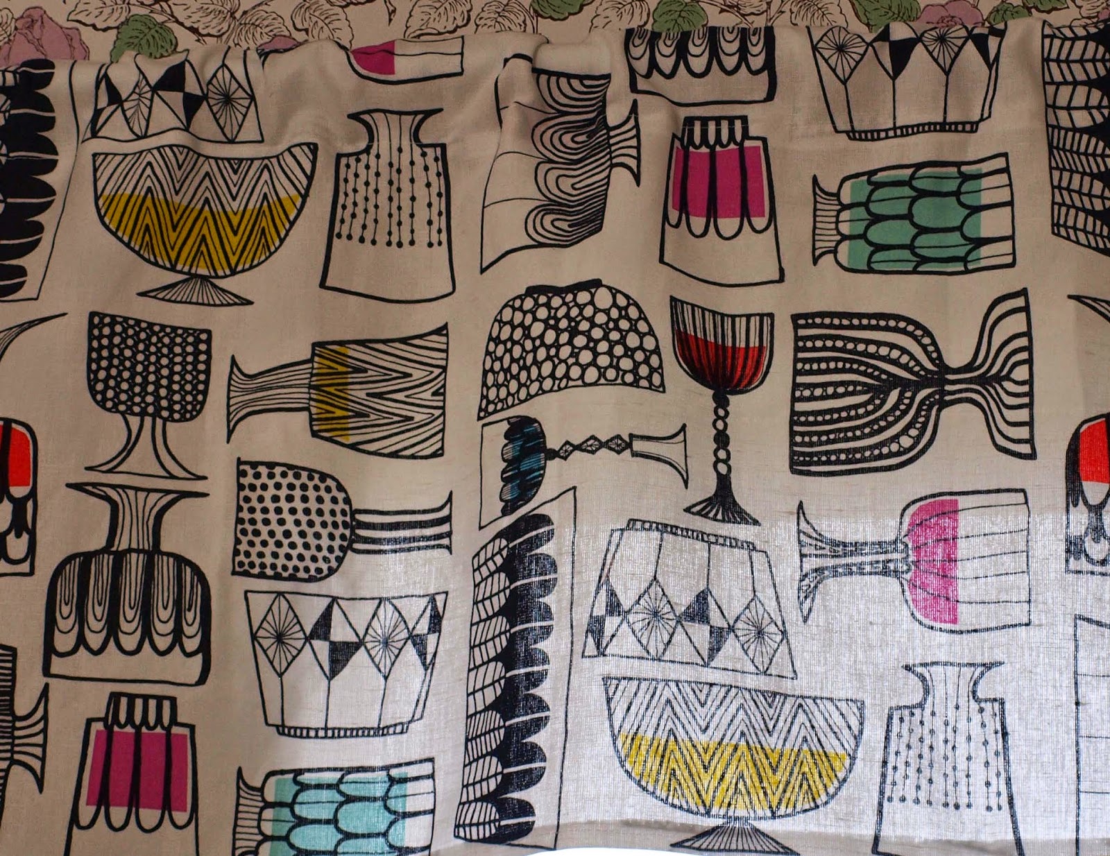
I also put up some valances I sewed from Marimekko's "Kippis"-fabric. It has a lovely mid-century feel, even though it was designed by Maria Louekari in 2008.

Vintage kitchen 50's mid-century valance Louekari marimekko kippis


Vintage kitchen pink valance marimekko louekari kippis mid-century


Marimekko has been creeping in to my decorating schemes more often now that my taste has slightly moved away from the mid-fifties and gone towards the later fifties/early sixties and mid-century modern. I find that the simpler patterns and bolder colours suit my taste better.

Friday, 7 March 2014

Walk-in Wardrobe Revamp

Pihlgren Ritola wallpaper tapetti


This is a little revamp I did last summer but only now got around to post. Remember my Tiffany Blue Bedroom post? Well, our bedroom has a walk-in wardrobe (one of the few things I insisted on when we built the house). It was dreary. I know it's not a place where I spend a lot of time but that's no reason, in my opinion, not to make it pretty.

Since the two long walls are taken up by shelves and a rail and the other short wall being basically all mirror, there is really only the far wall I can do anything to and most of it is covered by a chest of drawers.

This is the view that greeted me daily:

pine dresser wardrobe


A plain white wall with a pine chest. Nice.

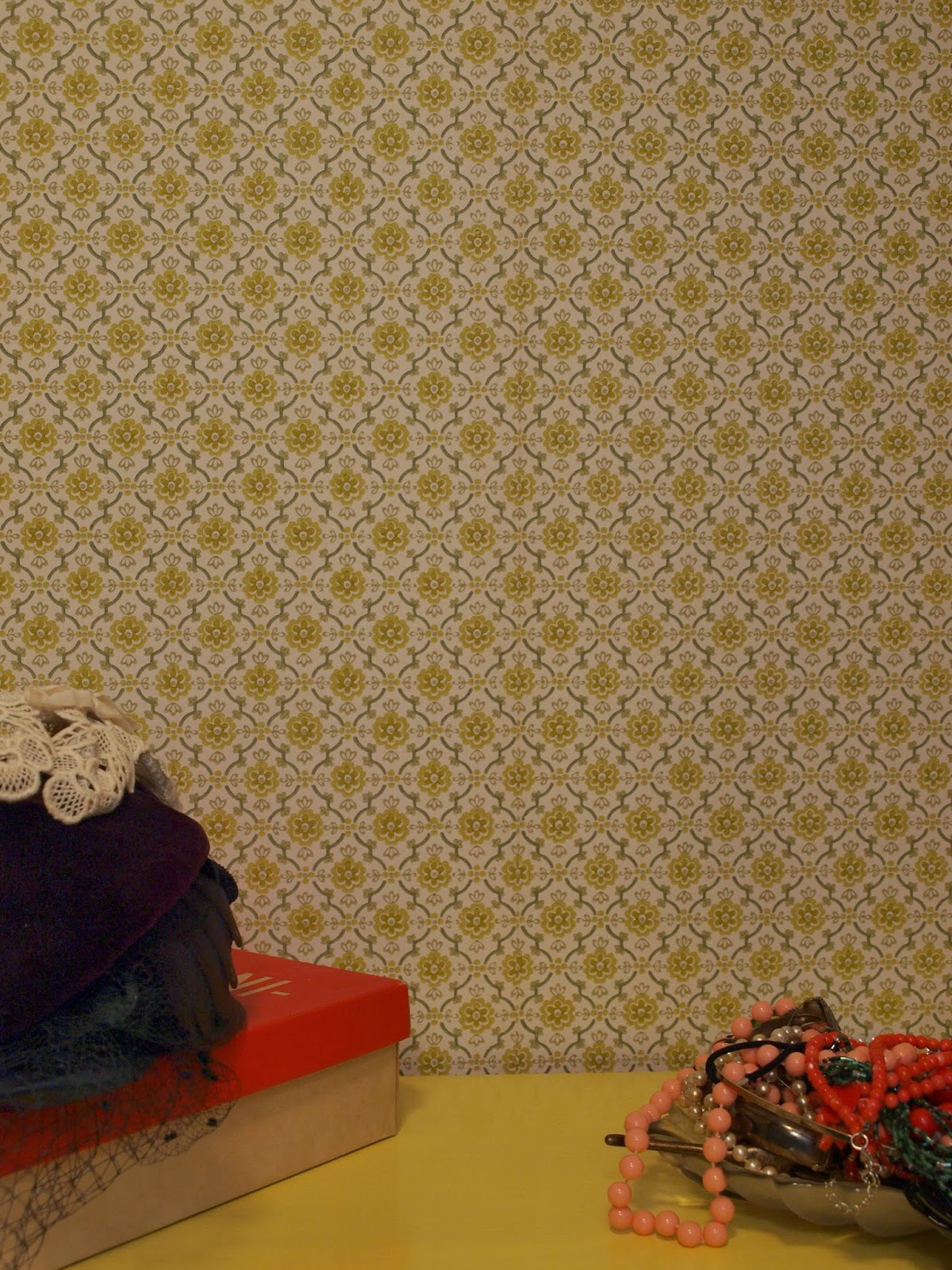
It just so happened, that I had found this short roll of gorgeous vintage wallpaper at a flea market. And it just so happened there was enough for the visible part of the wall. Hooray!

Pihlgren Ritola wallpaper tapetti green vihreƤ
I don't know what it is, but I'm in love with this wallpaper! It kind of reminds me of the wallpaper in my maternal grandmothers house in Austria...I have a suspicion that it's by Pihlgren& Ritola, but I have yet to make sure. Will report back when I know.

Then a lick of sunny yellow paint on the pine dresser and this was the result:

Pihjlgren Ritola tapetti wallpaper green vihreƤ wardrobe vintage Tapettitalo


Cute, no? Now every morning I'm greeted by a bit of sunshine.

Thursday, 22 August 2013

Tiffany Blue Bedroom


I had a touch of writers block with this post so finishing it took a while. About a month ago I repainted our bedroom because I wasn't happy with the colour it was. It was a kind of grey/brown colour. I mean it was OK, I suppose. It gave the room a sort of, umh, sleepy feel. (See, writers block, told you.) But now that both boys are sleeping in their own rooms, I wanted it to become an oasis of calm in an otherwise hectic and cluttered home.


So this was what I started with: brown with a pink accent wall behind the bed. I don't know what I was thinking. I like bright colours and a turquoise blue was an ideal choice for the bedroom. I suppose it took me this long because I read somewhere that blue was the most popular colour choice for bedrooms and I didn't want to be one of the herd, so to speak.

dressing table vanity vintage blue mirror perfume jewellery lucite

I love my bedroom. Sorry, I mean mine and Hubby's bedroom. It is the only room in the house we are keeping a completely toy-free zone. It's a room for relaxing, for getting away from it all. No mess, no toys, no TV or computer. It is the place where I apply my make-up and get dressed.

vintage books shelf pinup fashion history

My bookshelf with light bedtime reading...

vintage jewellery rack necklace bracelet dressing gown nylon 50's 40's

Jewellery racks made by darling hubby.


vintage dressing table vanity mirror seat jewellery bird


Here's another before and after.  I really like the way the blue makes all the other colours pop.

vintage bedroom makeover turquoise blue bright ikea mirrored frame croched bedspread

I still have one problem, though. What to do with the wall behind the bed? I've been toying with the idea of a wallpapered accent wall, but that's gotten a bit old. A narrow shelf would be nice, you know the kind you can prop small pictures on...hmmmh, I don't know.

Saturday, 8 June 2013

All The Pretty Skylarks or Downstairs Toilet Makeover

Birger Kaipiainen ken kiuruista kaunein tapetti wallpaper Pihlgren Ritola Tapettitalo

Let me start with something pretty namely the wallpaper that inspired the makeover. It's called "Ken kiuruista kaunein" (Who's the fairest skylark) in the colourway orange and it was designed for the Finnish wallpaper manufacturer Pihlgren ja Ritola Oy by Birger Kaipiainen in 1958. Pihlgren & Ritola had invited several artists and designers of that time to design wallpapers. The designs were maybe a bit showy for Finns at the time and they certainly weren't the most popular designs of that time, but they have an enduring appeal, in fact Birger Kaipiainen's "Ken kiuruista kaunein" in the colourway blue has been in production continuously since 1958 and is still going strong. I must note that I have been drooling over the orange version for years and have only now found a place to use it. I also have something planned for the wallpaper in the pink colourway, but that's another post altogether.

And now for the not so pretty: the "before" picture. We have lived in this house for six years now and the downstairs loo, or guest powderroom has not changed. When we were building the house we just wanted to move in quickly and decided to just slap some paint on the walls. The paint we chose was light gray. Neutral, non-obtrusive, functional. But also drab, dull and nondescript. A change was long overdue. I wanted colour, life, vibrancy, a bit of wow.

Dull, dull,dull
Putting wallpaper on all the walls from floor to cieling wasn't an option because of all the activities involving liquids that will be going on in that room. Not to mention the fact that these liquids will be mostly handled by two small boys. So the lower part of the room was painted with a water resistant, washable paint in the same yellow/orange as the wallpaper. We chose Luja by Tikkurila

Now a quick note to the good people of Tikkurila: Not all interior decorating is done by burly men with large and strong hands nor do all decorators have such persons at hand to help them with the paint tin. The lid of the tin has, what some might undoubtedly describe as "a new and innovative design, which enables the tin to be opened without any tools." So it doesn't have any of the metal flaps or holes you can pry open with a screwdriver that you get in a normal tin. Instead, you are expected to pull the lid open from the edge with your fingers while simultaneously pushing the lid inwards in the middle, like shown in this illustration. I HATE THOSE HANDS! So smug. So self-satisfied. "Look at us, we can push and pull at the same time! We are big and strong!".

Smug bastards

Anyway, once the tin was opened and two coats applied on the walls it was time to break out the wallpaper paste. The wallpaper is a traditional surface printed wallpaper and as such shouldn't be soaked for any longer than a minute. Putting it up was pretty straightforward and only took a few hours. The only thing I had to watch was treating the wallpaper carefully and not rubbing it since the colour does come off easily when the paper is wet.

Birger Kaipiainen ken kiuruista kaunein tapetti wallpaper Pihlgren Ritola Tapettitalo


The join between the wallpaper and the paint needed something and at first I thought a simple border would be just the ticket. But no simple borders were to be found. I then opted for the cheapo option which is a painted line. I went for the same bright periwinkle blue than in the wallpaper. Of course I wasn't going to go to the paint store and have them mix up one litre of it since I would only be needing enough for the stripe. So I mixed up my own using some leftover white paint and acrylic hobby paints.


Birger Kaipiainen ken kiuruista kaunein tapetti wallpaper Pihlgren Ritola Tapettitalo


Birger Kaipiainen ken kiuruista kaunein tapetti wallpaper Pihlgren Ritola Tapettitalo
And here's the finished stripe


Hurrah! ...now lets have a cocktail...

Birger Kaipiainen ken kiuruista kaunein tapetti wallpaper